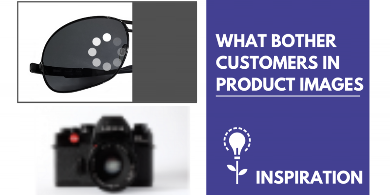
Most comparison engines do not allow you to add graphic elements or texts to product photos. When searching for goods, the same image is displayed by most of the sellers. Don't be among them and impress the customer with a unique picture. We'll tell you how.
There are various ways to differentiate yourself in a pile of image ads. Make unique photos of your products and stand out on advertising platforms. In the Feed Image Editor, you can set up such adjustments in bulk for different product queries.
ADD A SHADE
Do you need to highlight the contours of the goods to make the background stand out better? Give the products a 3D effect by adding a shade. It will make them look special on both white and colored backgrounds. Adjust the contrast, shadow direction, or thickness as needed.
PRODUCT REFLECTION
The reflection effect works similarly as a shade. You can use it, for example, for an assortment of cosmetics or jewelry. It adds cleanliness and looks more luxurious. See a picture of the product using that. In the Feed Image Editor, you can easily adjust the angle of reflection, the distance from the product, and its transparency.
TIP
Social networks like Facebook and Instagram accept the addition of graphic elements. Use it, for example, for thematic advertising. The article How to work with thematic image campaigns will help you with this. In the Feed Image Editor, you can use templates, labels, or editable texts. Adapt them to the different advertising needs for your online store.
ROTATE THE PICTURE
Many online stores use the same photos they receive directly from the manufacturer or supplier. They then upload them to their online store without modification. Almost all the stores do it the same way. Try to avoid this and turn the product to the opposite side. Let us see this in the example of a refrigerator.
But be careful. This effect does not apply to products that contain text. If you turn them the other way, they become unreadable.
FILL THE AREA AND ALIGN THE IMAGE
If you want to stand out with the pictures, make these adjustments. Display the product in the maximum area. Ideally, it should take up 75% to 90% of the space. Another minor adjustment is the alignment so that the products do not look scattered. It will avoid creating unnecessary space that you can use otherwise.
IMPROVE THE QUALITY OF THE PRODUCT IMAGE
A poor image spoils the customer's impression of the product or quality of services in your shop. The small size of them may prevent you from getting into advertisements. If you enlarge small images in the traditional way, they may not be high quality. The solution is to enhance the resolution (upscale), which in the Feed Image Editor may increase the dimensions and improve the quality of the images.
TIP
There are many more features in the application. In the article AI and machine learning help with advanced features in the Feed Image Editor, we discuss background removal, upscale, watermarks, and poor image quality detection.
Setting up image advertising and meeting product requirements can be challenging. At the same time, it is important not to fall among the number of other shops offers and to differ from them so that the customer clicks on your goods. The above-mentioned tips help you achieve this. Try them out in the Feed Image Editor and find out how easy it is to set everything up with it.


Add new comment