Easy, colorful, bold, with an enticing CTA. That is what your image campaigns will look like with our app. Read tips on how to quickly remove the background, the layout of elements and their combination, and examples of use for different assortments.
Feed Image Editor offers you several graphic options. You can easily create many types of images from scratch or customize pre-made graphic templates that we regularly supply for you in the application. Get inspired by ten examples of templates and start creating your quality image campaigns.
GRAPHIC TEMPLATES FOR IMAGE CAMPAIGNS
Geometric shapes, graphic elements, pre-prepared CTAs, recommended color combinations, and more than 150 fonts. That's just a fraction of what you'll find among the template creation tools in Feed Image Editor. See how we work with them.
Claim that you offer free delivery or a gift
Do you offer free delivery (shipping)? Let your customers know about it. The shipping price is crucial for many customers. They often base their decision on where to buy goods. It is doubly true in the case of great competition.
If you offer it, be sure to let them know using one of the many stickers you can find in our application.
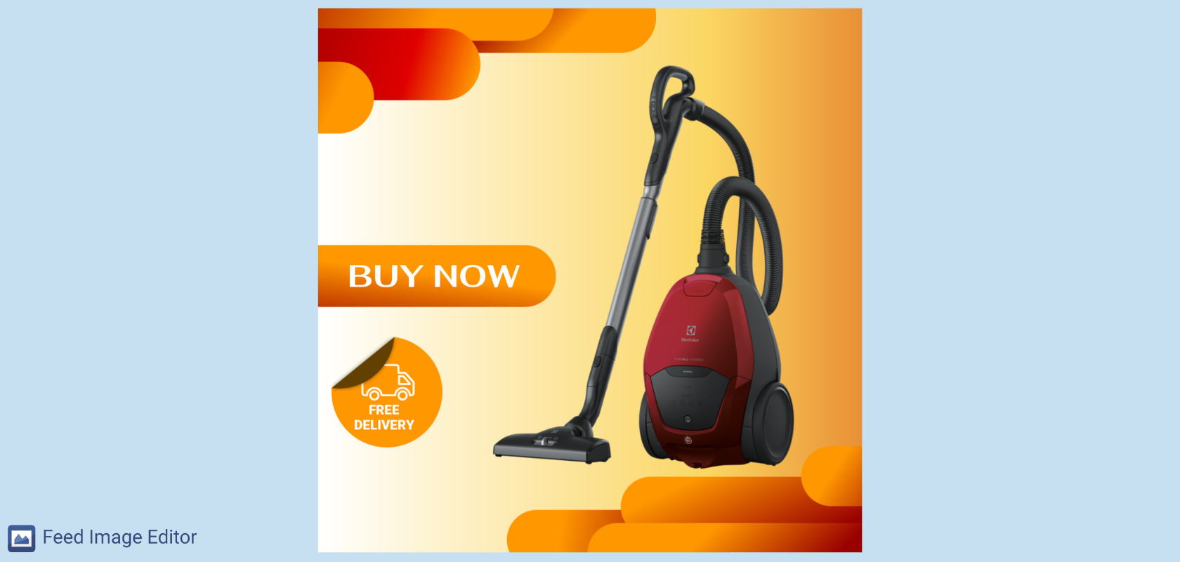
People like surprises and free stuff. Please a customer with a little thing that will make them order from you again. Include, for example, advertising items of your brand with the goods.
Sale, sale, sale
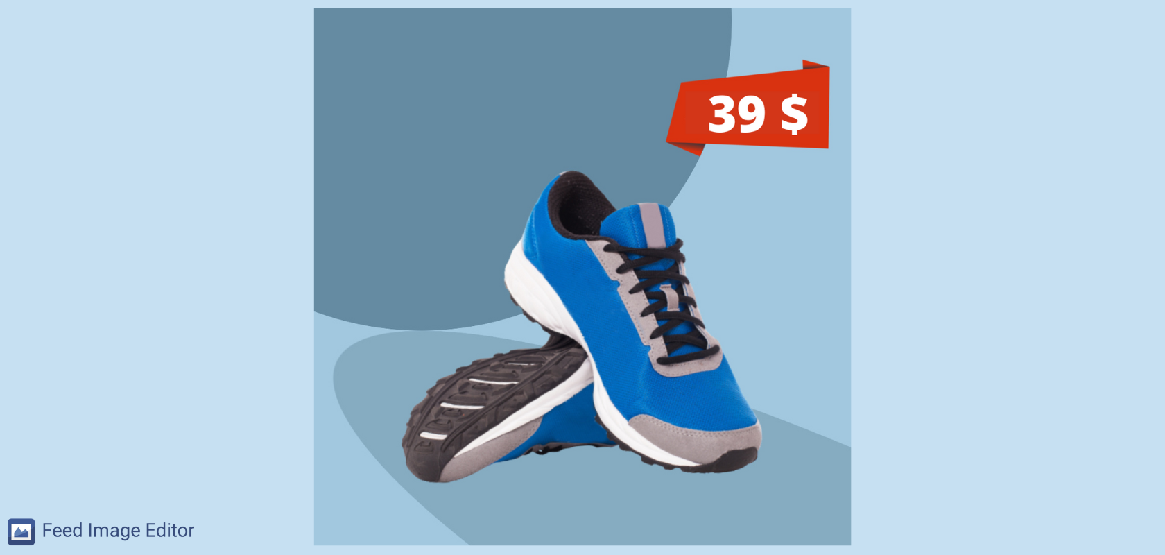
Are you having a sale and want everyone to know? Bold colors that every eye can see will help you.
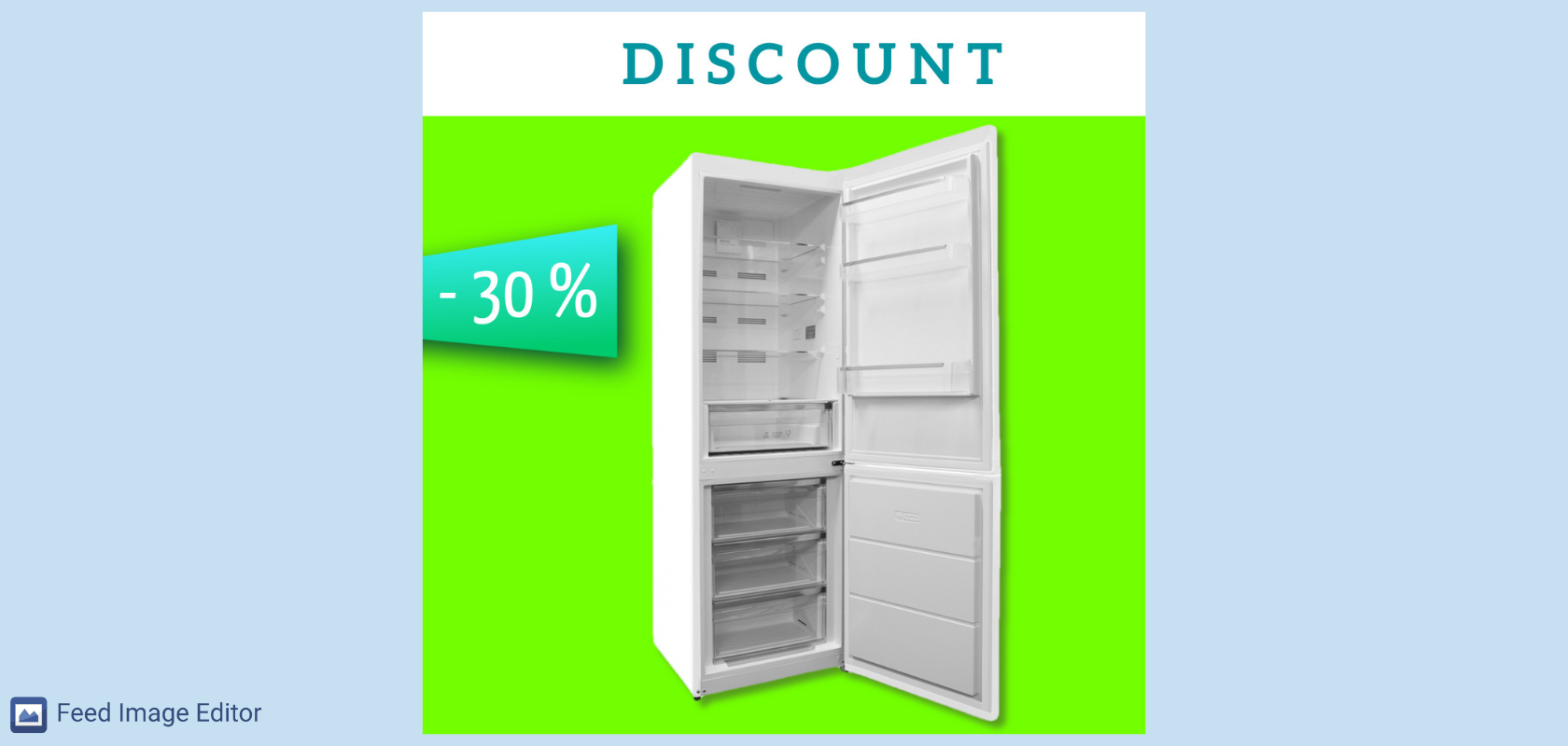
Red is constant among the sale colors. With the help of a rectangle, triangle, and square, you can create a template that will stand out.
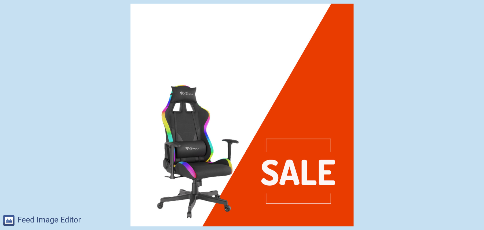
Show customers the current product price
Whatever range of goods you sell, customers are interested in its price. Set its bulk and automatic rewriting in the template, using the afore-mentioned Feed element layer. The price will be displayed according to how it is listed on your online store.
Product availability and options to choose
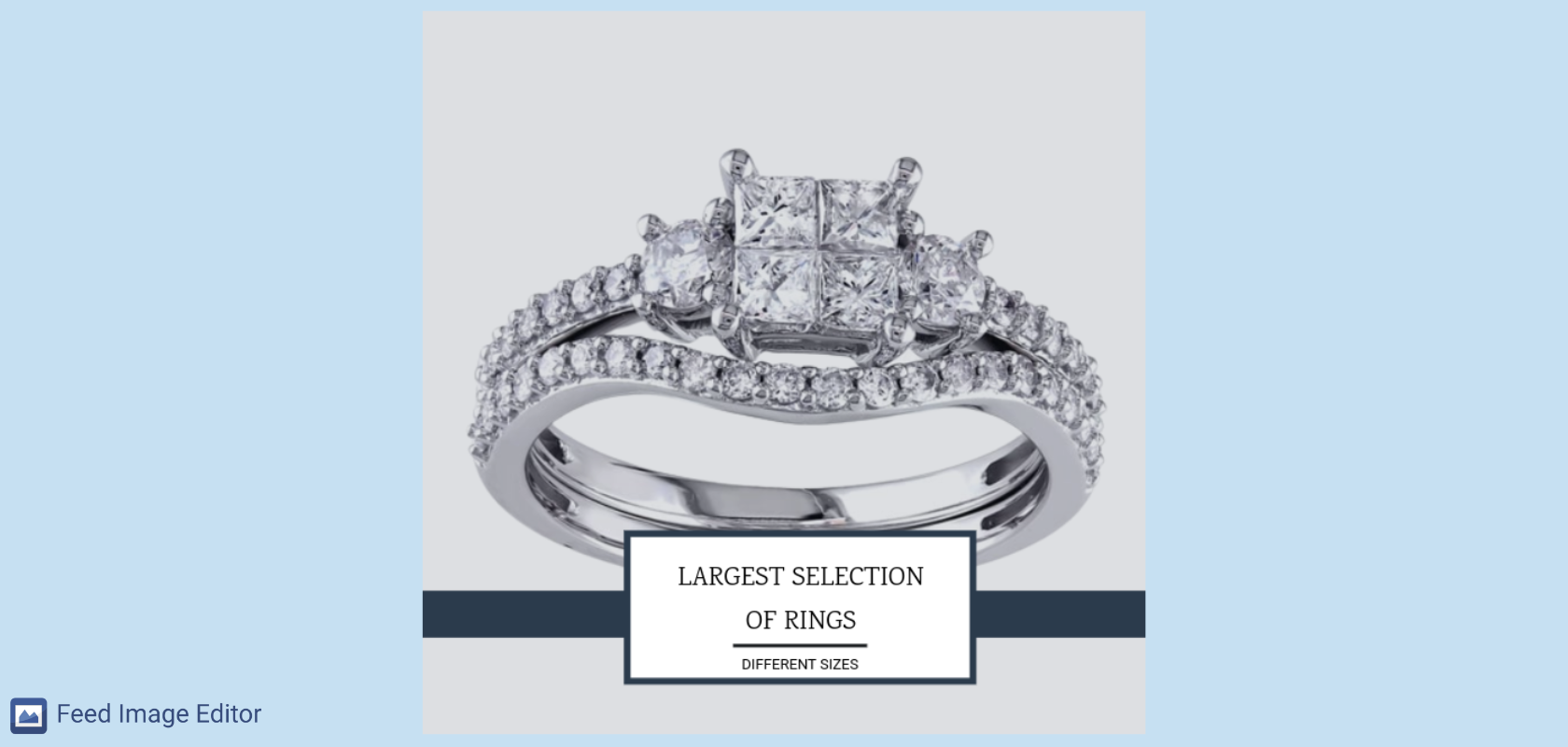
It's not always just about the prices. Sometimes it is enough if you show in the advertisement what is an advantage in your store compared to the competition, for example, just like in the template below. If a customer decides to buy a ring, he will easily remember that you have a lot to choose from.
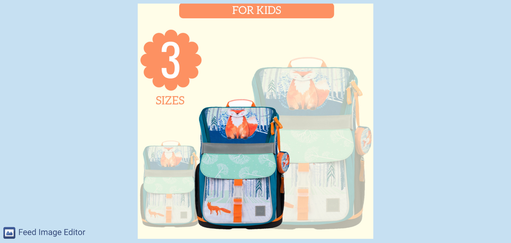
Another template includes two benefits. The first is that the goods clearly show suitability for children. The second is the option to choose from three sizes. Similarly, you can point to other variants of one product. In the fashion industry, for example, T-shirts in different colors or ready-to-wear sizes.
Short term campaign
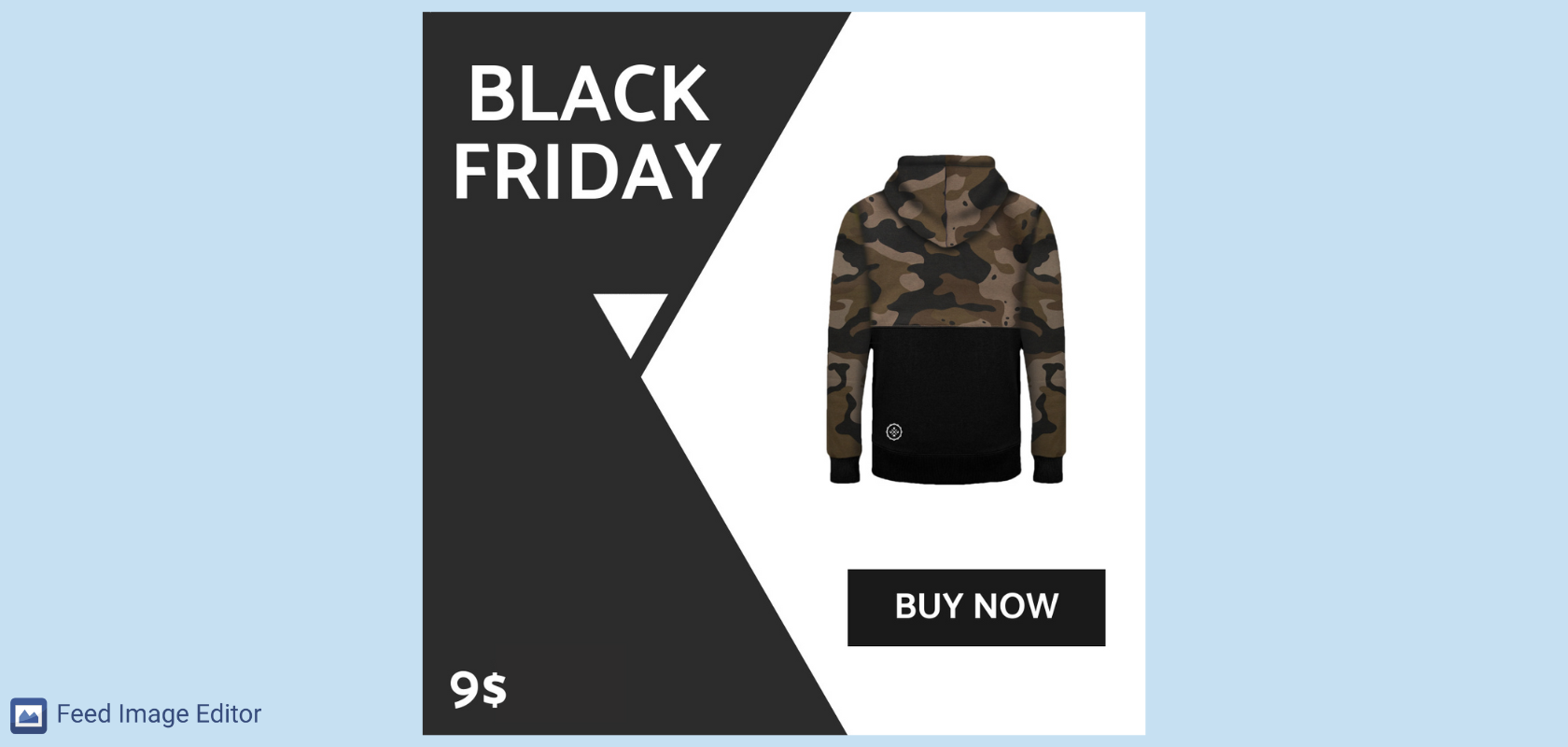
Perhaps the most famous "holiday" in the shopping world is Black Friday. The very term already means shopping at low prices for many people. That's why we used it along with the price and the option to add the product directly to the cart. Hesitating when buying a discounted item can mean that the product may be sold out in a short time.
News at your place
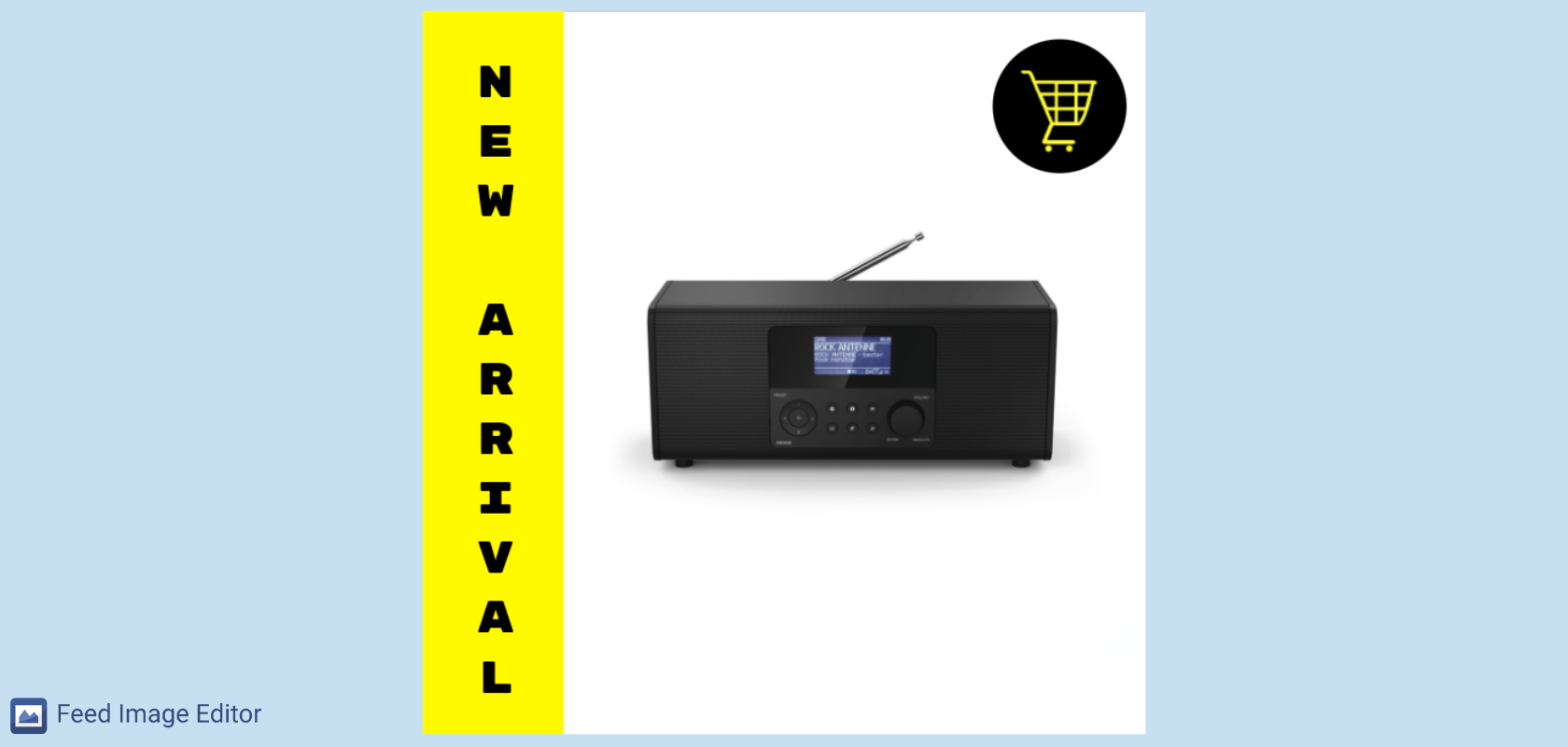
Show off the new goods on your online store. Similarly, if you are one of the first sellers to offer a product, create a template that says "New." If the product is available only in your online store, use the text "Only available here."
Focus on the target group
Knowing who the products in your store are for is one of the foundations of success in advertising. If you're selling goods aimed at ladies, use, for example, softer colors, fonts, or emojis like a heart.
Also, remember that they can get a watch as a gift. Therefore, try a more general template with a "Gift Tip" CTA.
You can also adjust the appearance of ads according to the largest user base. Advertising on Snapchat will look different than on Instagram or Facebook.
👉 TIP
How to create a CTA in product images? Read the article Support the sale of your product images by inserting a CTA or other elements.
We also recommend the Ideal parameters for the product images article. In it, you will find out which advertising systems support visual advertising.
These are the 10 template tips you can find in the Feed Image Editor app. With them, you can customize all elements, remove selected ones or add your own. You can also change the color or add your brand logo. If you haven't used our tool yet, try it for free for 30 days.


Add new comment